
[Where to focus with Facebook’s new interface – Digital Marketing – Part 13]
This is probably going to be an unpopular opinion – I like Facebook’s new interface.
Much earlier to this new rollout, many people had received the layout trials for Facebook with an opt-out option which was cemented this September.
Many people voiced their HATRED on the new design an example of which is compiled in this article. The comments are mostly on few bugs which can be fixed and rarely on the usability. Some pointed out that the new layout was confusing to them as they could not figure out where to make posts.
In my opinion, there is a lot going in favour of Facebook’s new design than against it.
Let us look at them in detail:
#1 Clean design like Medium
One of the changes that is immediately visible is in your own profile. If you look carefully, the cover picture, along with the placeholder for your profile picture, cover the width of the screen. Secondly, anyone who visits your profile knows about you instantly, via your bio which is immediately below the cover and profile pictures.
Every other element like the timeline content, photos and so on are available only after a scroll. The same design is also applied to Facebook pages with the largest view is for cover picture. Other than that, page name, category and about section stand out. It would make sense for page owners to use their cover pictures to the fullest.
My first impression of this feature reminded me only of Medium where posts with feature images cover the width of the screen which allows soaking of information of what is to follow is in a clutter-free and clean way.
#2 Engagement driving tabular sections
Home feed, pages, videos, marketplace, and groups. These are the five elements that stick at the top of the interface and on-click on any of these items takes you to a separate tab. Each tab under these categories have their own feeds. It is like having 5 home feeds instead of one. 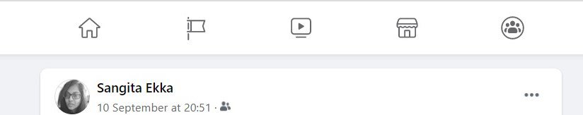 Notifications on this tab are available for pages and groups while personal notification system stays largely unchanged. It would be interesting to see how Facebook decides to notify users about videos and marketplace. Currently, video notifications come along with personal feed while marketplace visit is voluntary.
#3 Creator centric and brand building
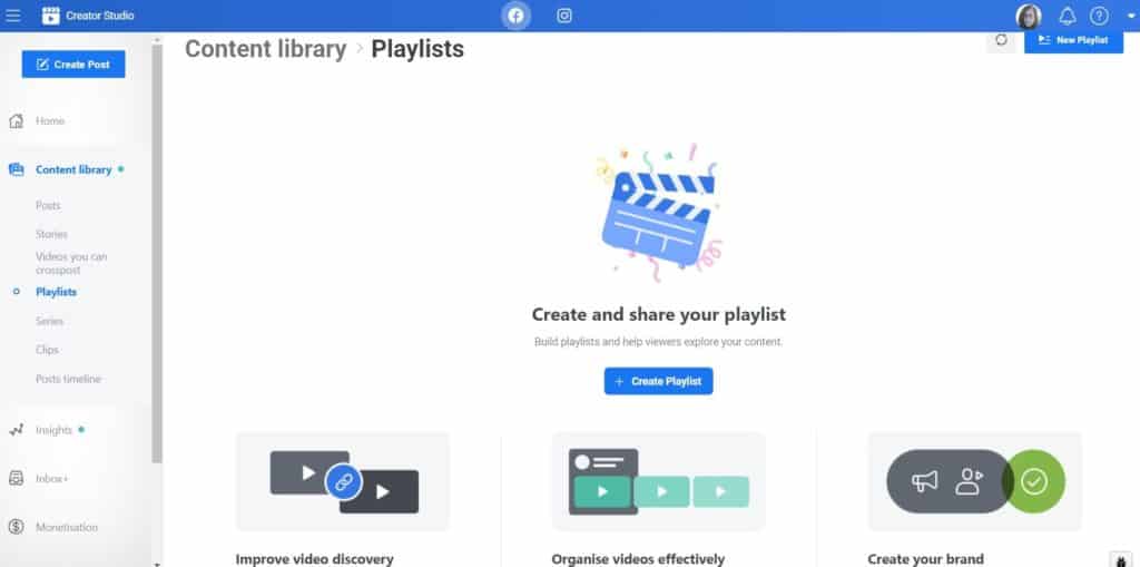
Facebook’s interface, current or previous has carefully accommodated most of content formats – text, images, text on images, videos, GIFs, and so on. Navigating the features in Facebook’s Creator Studio shows a strong bias for the video format.
This is not new, YouTube has a Creator Studio for easy access to video uploads, managing playlist, and access video analytics. Facebook’s Creator Library encourages video discovery, video organisation, and creating one’s own brand. Monetisation of the videos is also available if a particular page qualifies for it for in-stream ads or paid online events.
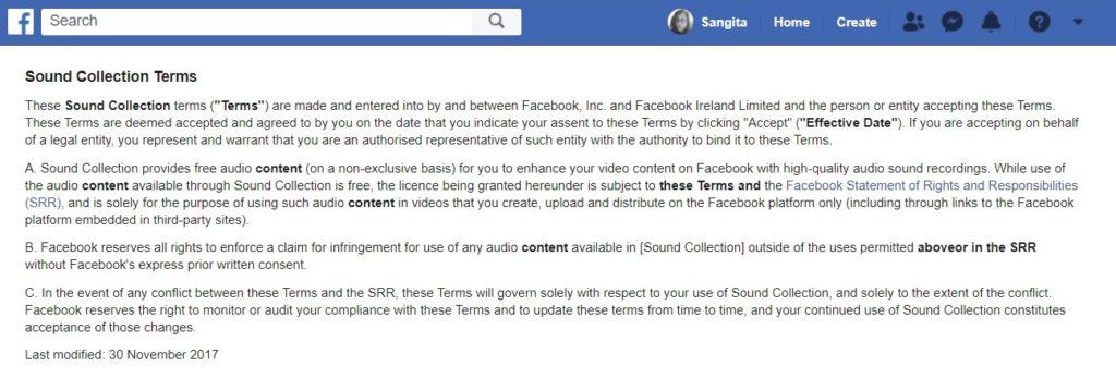
In addition to that, Facebook is also streaming royalty-free music for video streaming to avoid copyright violations which may unintentionally be created by the users.
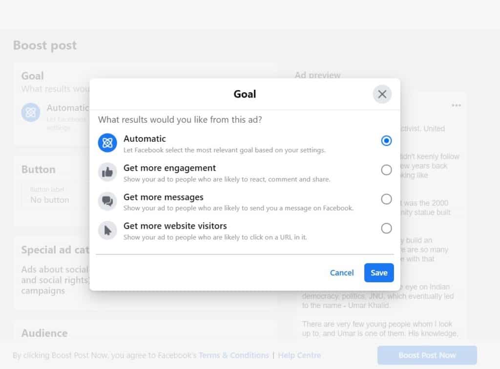
#4 In-sync with Instagram for ad goals
If you haven’t used a professional or business account with Instagram, read this and this. The ad goals on Instagram are to the point. Since a user can connect IG and Facebook page accounts, it becomes a lot easier to place ads on both platforms through one promotion-setting. Also, Facebook’s post-promotion settings are a lot cleaned up.
#5 Quality over quantity by limiting ads
Facebook is putting a limit on the number of ads a page can run depending on the page size. This will be fully implemented by summer of 2021. For most of the page owners this is not an issue for budget constraints. For larger organizations however, it is an opportunity to learn about the “learning phase” of Facebook ads where it is optimised for the target audience. The larger benefit is to create more quality and efficient ads than just more ads.
Conclusion
Twiddling around Facebook’s new interface is more of an amalgamation of picking the best features of other social media handles which were built to drive engagement. This new layout stands strongly in favour of creators with special emphasis to video content. Page owners can plan on content variety to be disseminated on this platform with a strong focus on video content.
TABLE OF CONTENTS FOR DIGITAL MARKETING SERIES
IF YOU LIKE MY WORK, YOU CAN ALSO SUPPORT ME ON PATREON!